


A brief history of the development of the Port Vale badge or crest from its origins to the modern-day design.
Early days
 In the early days of the club’s existence the club took on the Burslem coat of arms (right) as their emblem and this shield was adopted by the club from around 1878 onwards.
In common with many football clubs at the time, the team still wore kit unadorned with badges so this design was rarely used or seen.
1952
 We have to move seventy years forward to the 1950’s before we see the emergence of another Port Vale crest. At that time, Vale had largely stuck with white shirts and black shorts and the first crest (which was used on the team shirts) complimented the outfit perfectly. It was first used in 1952 and consisted of a Staffordshire knot with the letters “PVFC” within it (right).
 We have to move seventy years forward to the 1950’s before we see the emergence of another Port Vale crest. At that time, Vale had largely stuck with white shirts and black shorts and the first crest (which was used on the team shirts) complimented the outfit perfectly. It was first used in 1952 and consisted of a Staffordshire knot with the letters “PVFC” within it (right).
1956
In 1956, the Valiants adopted what many fans consider the club’s classic crest when they adapted the Burslem coat of arms (see pull-out box for more details) into the club colours of black and white.
In 1956, the Valiants adopted what many fans consider the club’s classic crest when they adapted the Burslem coat of arms (see pull-out box for more details) into the club colours of black and white.
What’s in a crest?
 The 1952 badge is a derivation of the Burslem coat of arms and takes on symbols from other Stoke-on-Trent crests. The scythe comes from the Tunstall arms, the “fretted cross” from Audley while the two pots symbolise Josiah Wedgwood’s towns (Burslem and Etruria). It was “re-adopted” by the club in the new millennium when it was used on the back of several kit designs although the current badge remained the club’s official design.
![]()
There was also a red and gold version of this crest (red and gold being the original colours of the Burslem coat of arms the design was based on) which was used on the players’ blazers.
The crest from Vale player Stan Turner’s blazer is shown on the right.
1974
 Club crests went out of fashion in the mid to late 1960’s, so in 1974 a new Port Vale badge was used (right). Vale at the time were wearing Admiral kit and their white shirts and the style of the “PVFC” design owed a lot to Leeds United’s 1970’s “LUFC” logo. It was used on and off until 1981 by the the club. The image on the right is a 1974 photograph of Mick Cullerton in a Vale kit featuring that design.
 Club crests went out of fashion in the mid to late 1960’s, so in 1974 a new Port Vale badge was used (right). Vale at the time were wearing Admiral kit and their white shirts and the style of the “PVFC” design owed a lot to Leeds United’s 1970’s “LUFC” logo. It was used on and off until 1981 by the the club. The image on the right is a 1974 photograph of Mick Cullerton in a Vale kit featuring that design.
1978
 In 1978, an unusual badge which reflected the club’s “Valiants” nickname was used (right). It consisted of a knight on a horse with the text “Port Vale” at the top. It only lasted a few years before a new crest was in operation for the 1980’s.
1982
 The new design was the winning design from a competition for schoolchildren (right) and featured the letters “PVFC” a Staffordshire knot and a bottle oven kiln. It debuted during the successful 1982/1983 promotion season. You can read a little more about how this badge was designed here
1986
In 1986 the current Port Vale badge was adopted. Once again, we’ve examined this design in more detail through the pull-out box below.
In 1986 the current Port Vale badge was adopted. Once again, we’ve examined this design in more detail through the pull-out box below.
What’s in a crest?
 The current badge continues the club’s association with Wedgwood by using the Wedgwood blue colour.It maintains the now familiar Stafforshire knot and bottle ovens and uses “1876” as the club’s formation date (the first time this is referenced on a Port Vale crest).
2013
![]() In 2013, the club’s new owners proposed a Port Vale badge change for the 2014-2015 and asked fans to decide if the club should adopt a new badge or not. The proposed badge was largely based on the 1950’s design but with the addition of the slogan “For all who have gone before” in order to pay tribute to former players, fans and staff.
In 2013, the club’s new owners proposed a Port Vale badge change for the 2014-2015 and asked fans to decide if the club should adopt a new badge or not. The proposed badge was largely based on the 1950’s design but with the addition of the slogan “For all who have gone before” in order to pay tribute to former players, fans and staff.
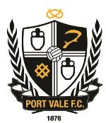
After feedback from fans, the final design, pictured left, which was to be used during the 2013-2014 season dropped the slogan and added a Staffordshire knot to the top of the crest and the club’s foundation year (1876) to the bottom.
OVF would like to acknowledge the information on the following websites which helped us to write this article:
1. http://www.historicalkits.co.uk/Port_Vale/Port_Vale.htm
2. http://thebeautifulhistory.wordpress.com/clubs/port-vale/
More OVF features on Port Vale badges and crests:


Add your first comment to this post