





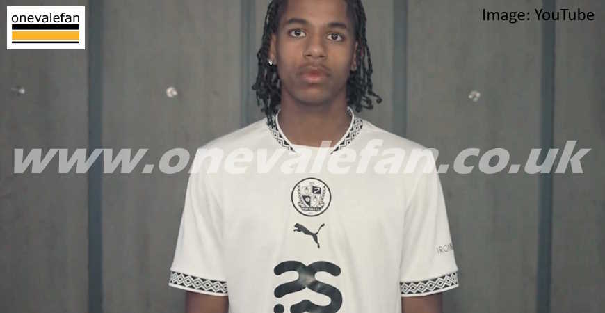
Port Vale FC have revealed their home kit design for the 2024/25 League Two season.
About the kit
The new kit, with white shirts and shorts for the men’s side and white shirts and black shorts for the women’s team, features a vertical line of Port Vale crest, Puma logo and main sponsors logo on the front while a black and white pattern adorns the neck and sleeves.
It is described by the club as “Emblazoned with a central crest, The Valiants will take to the Vale Park pitch donning a modern all-white kit, complete with a black collar and sleeve cuffs that fashion a design inspired by the Wedgwood Institute in our hometown of Burslem.
“Darren Moore’s side will return to white shorts and socks look for the first time in three seasons whilst Jack Day’s invincible, title-winning Women’s team will head into the new campaign with black shorts and white socks.”
The kit is shown in this video posted on social media:
In a world of change, the one constant is you.
Introducing our 2024/25 Home Kit!#PVFC | @PUMA pic.twitter.com/HubXfvKtmF
— Port Vale FC (@OfficialPVFC) June 14, 2024
Kit Launch weekend
The kit will available to purchase from Saturday 15th June and there will be a “kit launch” event at the stadium where fans will be able to meet two of the first-team players as well as take part in various activities and entertainment.
Find out more about the event here
 Port Vale kits through time

The good, the bad and the ugly – which is your favourite? Check out our special feature showing Port Vale kits through the years. It contains home, away, goalkeeping and special kits from over the last hundred years
What do you think about the kit design? Share your thoughts and post a comment below.

A cheap looking, uninspiring calamity. Whoever designed that needs help! £48 for a white top with what looks like a cheap iron on badge.
I think it’s one of those you like it or don’t personally I think it’s better than last year sales will decide if it is a success
Better than last years. But I’m not going rush out a buy one. Will wait for away top just hope its more detailed
Whos Josiah WedgEwood ?
Yeah like it back to just black and white like it should be
Well after last years Hull Kingston Rovers attempt, and the white one with black flashes firing over the shoulder, looks pretty dam good to me
Fantastic kit all white not to many frills..takes me back to 69/70..season John james tommy mclaren ..ball..Horton. summerscales..etc..love it 10 outa 10 from me
I never quite see what fans obsession with the kit is. As long as it is predominately white, does it really matter?
The away kit is in the clip also, strain after Dipepa at the end, if flashes up for a .millisecond.
Shouldn’t type drunk!
The away kit flashes up for a millisecond, just after Dipepa at the end of the clip.
Better tops in primark
I like it, best kit for a few years.
@BHF Thanks for the note on Wedgwood. The club press release had it spelt incorrectly as “Wedgewood” and the quote was taken from there but I have corrected it on this article and removed the errant “e”.
The Valiants
Another poor design in what could be so simple as we play in white.
We need to look at the top being appealing to all to gain extra Kudos and extra income.
Very poor design indeed ……..
Better than last year, but I won’t be buying one. I don’t mind the diamond design on the collar, but the matching diamond design on the sleeves make it look too feminine. In fact I’d say it was probably designed for the female market, thinking that blokes would just buy it anyway. Not for me.
Modern day version and reminiscent of the white kit used in the Gordon Lee inspired promotion 1969-70. Hope next season’s results mirror image that great memory.
I like it but won’t Umbro have something to say about using their diamond logo on the sleeves?